poison.studio
© 2025 All rights reserved.

Cre8

Building

Consultancy

Year:
2024
Industry:
Construction
Location:
Preston, UK

The Brief.

This is where we put a short summary of the brief, explaining what we were trying to achieve, what the though process was, and how we went about creating the assets.

We also discuss some key highlights, challenges and behind the scenes stories, giving our visitors a sense of involvement, and showing them that sometimes things do not go as planned, and that's okay.

Most brief summaries will be concluded with short, two or three sentence-long paragraph, which will act as a closing statement (kinda).

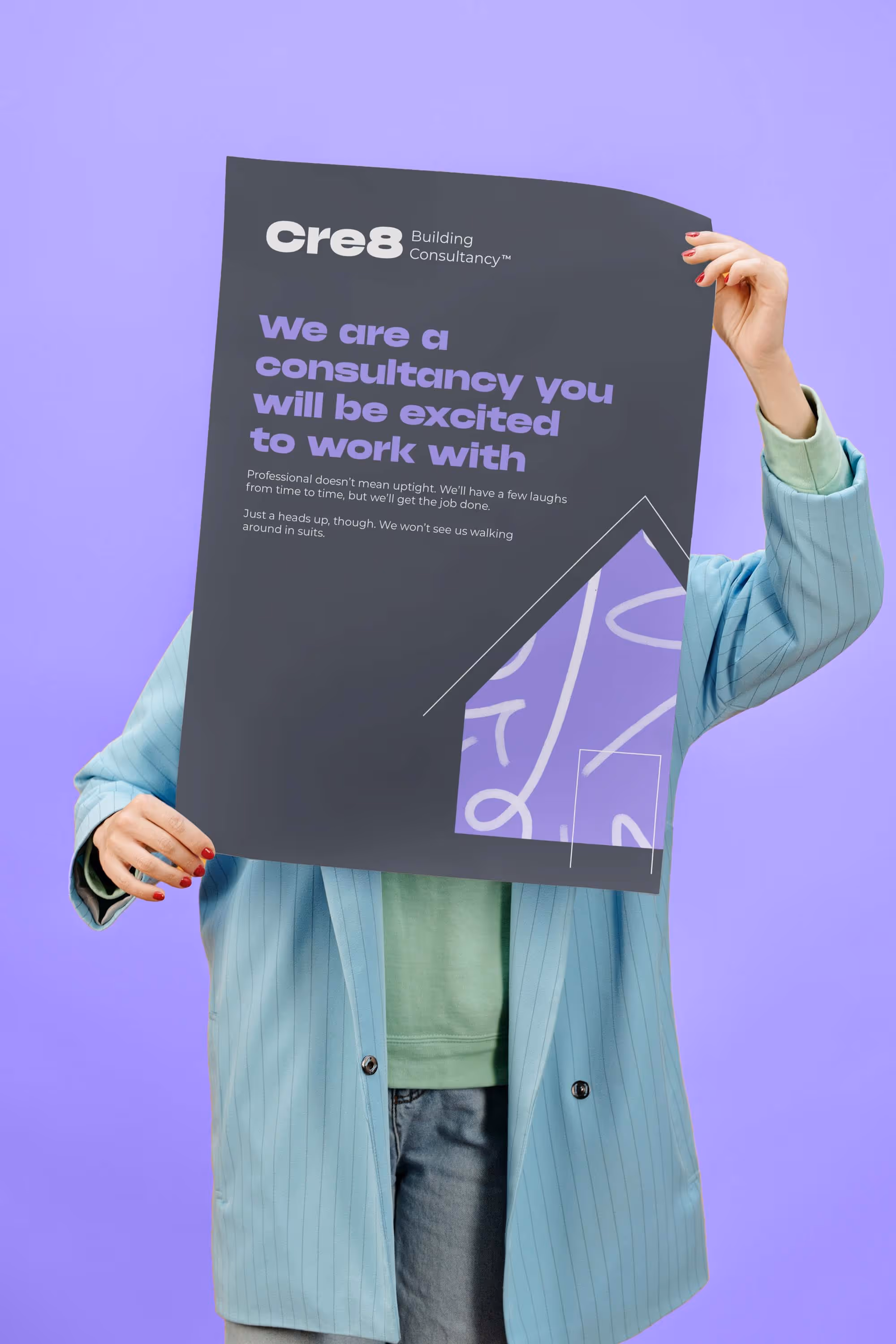
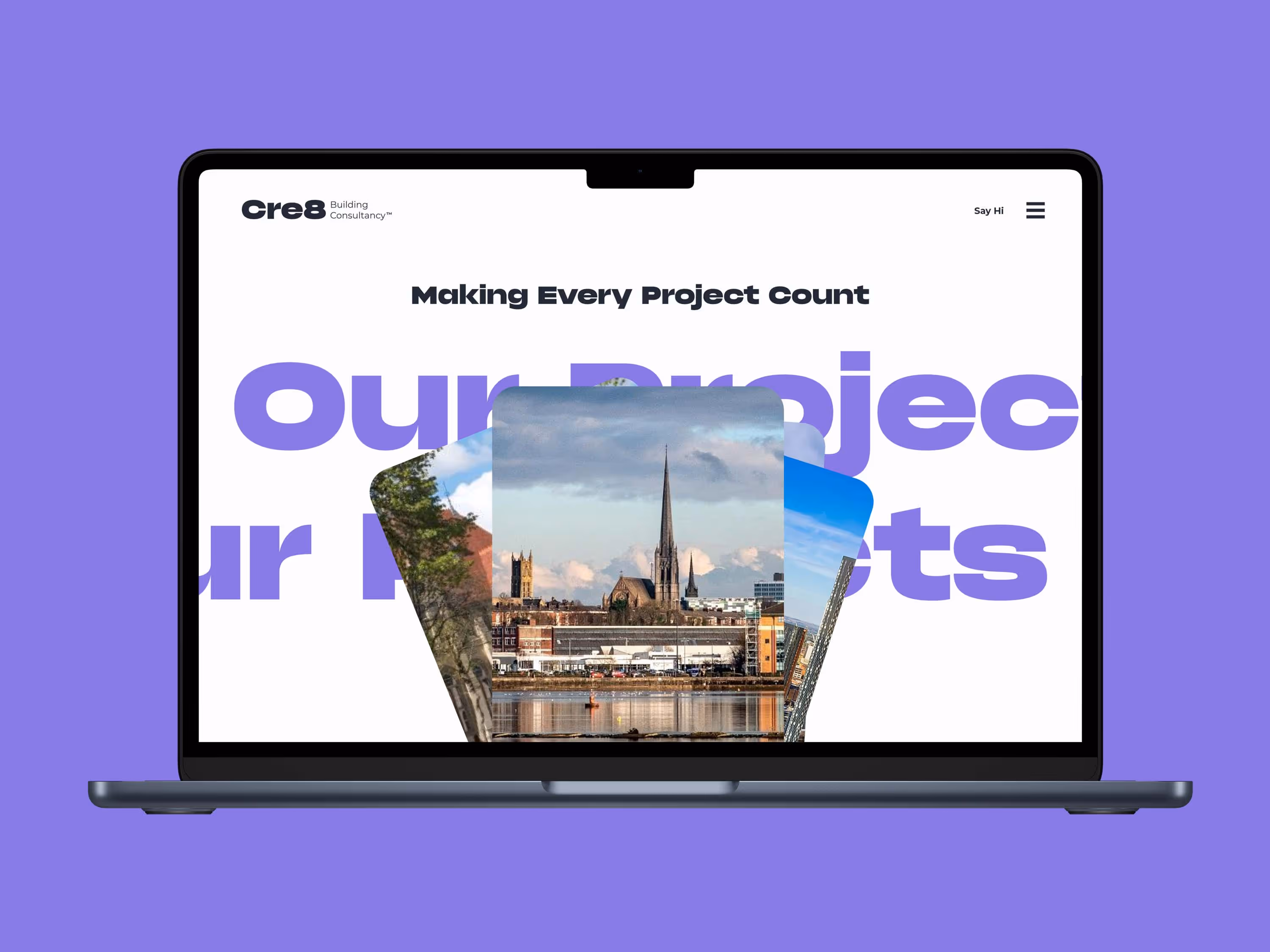
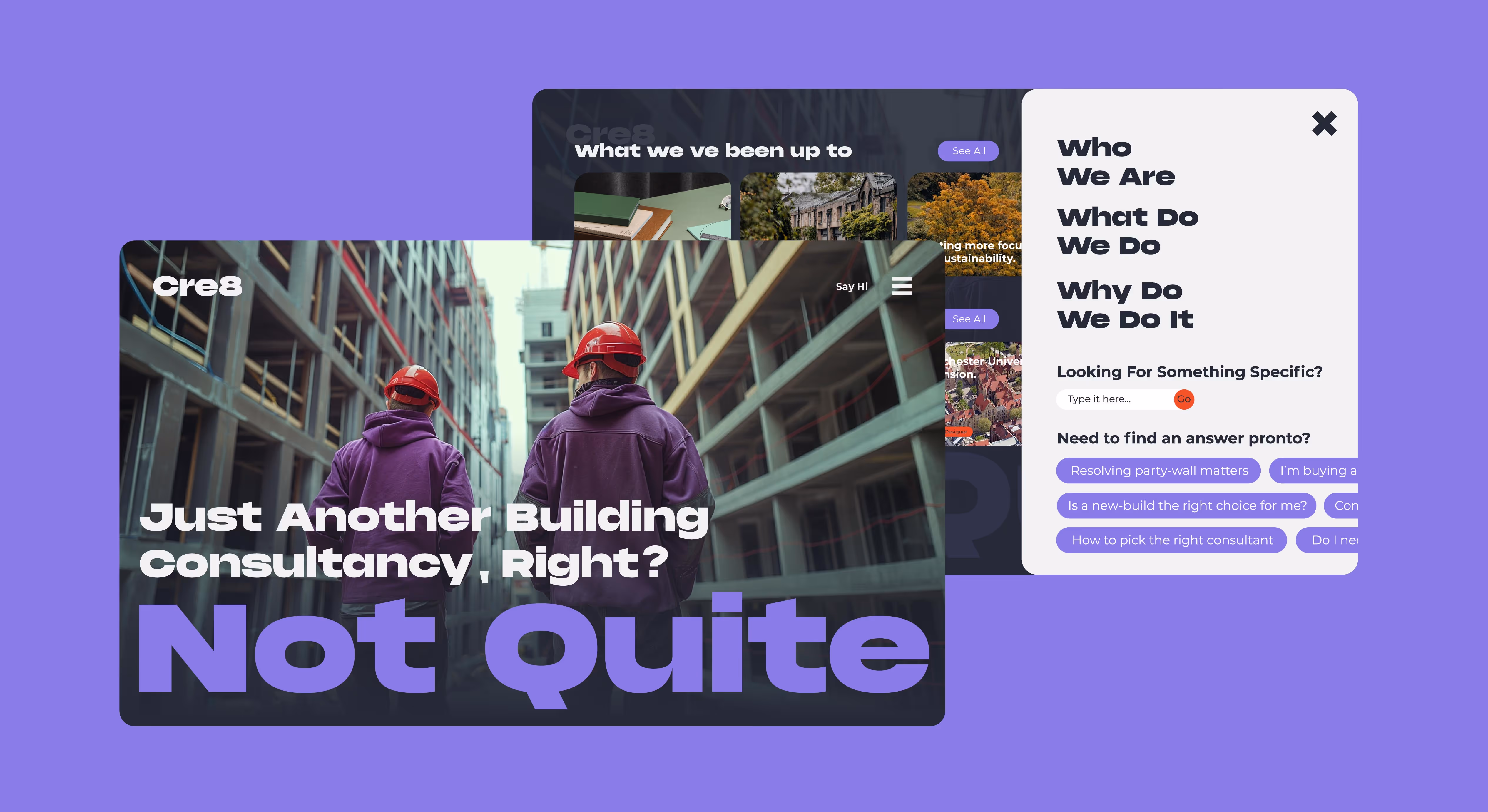
This visual identity study for Cre8, an independent building consultancy based in Preston, was all about capturing personality. Will and Joe, the founders, bring a refreshingly bold and human approach to building surveying -one that's miles away from the typical greyscale world of the construction industry. Our concept focused on reflecting that spirit through a vibrant and expressive colour palette built around four custom tones: Fun (a lively purple), Brave (a bold, red-orange), Not Black (a dark blue-grey), and Not White (a light grey with a warm undertone. Together, these colours formed a foundation of a visual language that felt energetic, distinctive, and unmistakable them.

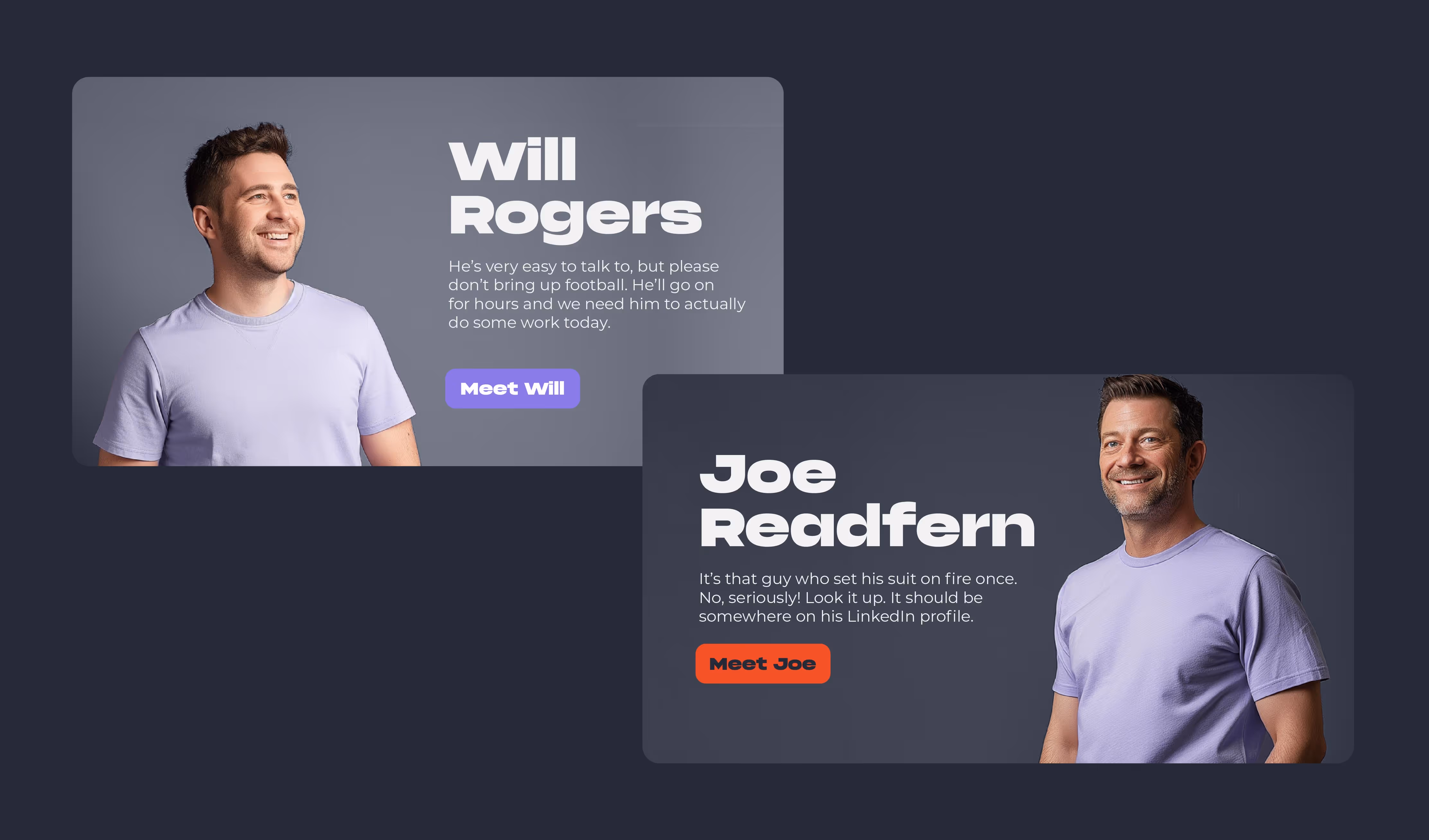
Beyond colour, the concept placed a strong emphasis on showcasing the people behind the business. We wanted the identity to feel approachable, characterful, and above all, real - so potential clients would see Cre8 not just as consultants, but as collaborators. The result is a design direction that balances professionalism with personality, and brings a much-needed dose of colour and character to a traditionally conservative sector.

The Team.

This is where we put a short summary of the brief, explaining what we were trying to achieve, what the though process was, and how we went about creating the assets.

We also discuss some key highlights, challenges and behind the scenes stories, giving our visitors a sense of involvement, and showing them that sometimes things do not go as planned, and that's okay.

Most brief summaries will be concluded with short, two or three sentence-long paragraph, which will act as a closing statement (kinda).

Creative Director: Adrian Trutkowski

Account Manager: Chloe Javed

No items found.
Phonk Contrast
Montserrat
Primary Colours
Aa
#252A36
Aa
#8874E3
Aa
#F1F2F2
Aa
#E74629
Aa
Secondary Colours

View More Projects.

Client:
Bevlan Office Interiors
Location:
Lancashire, UK
Year:
2024
Client:
Botaniq+
Location:
Montreal, Canada
Year:
2025
Client:
Open Financial Services
Location:
Accrington, UK
Year:
2024
Client:
Flexiwork
Location:
Accrington, UK
Year:
2024
Client:
Tamareco
Location:
Darwen, UK
Year:
2024
Client:
Arcana
Location:
London, UK
Year:
2023
Client:
Lloyd Tichio Productions
Location:
New York, USA
Year:
2025
Client:
Le Clubhouse™
Location:
Montreal, Canada
Year:
2024
Client:
Zenith
Location:
Warsaw, Poland
Year:
2024