The Brief.
We also discuss some key highlights, challenges and behind the scenes stories, giving our visitors a sense of involvement, and showing them that sometimes things do not go as planned, and that's okay.
Most brief summaries will be concluded with short, two or three sentence-long paragraph, which will act as a closing statement (kinda).
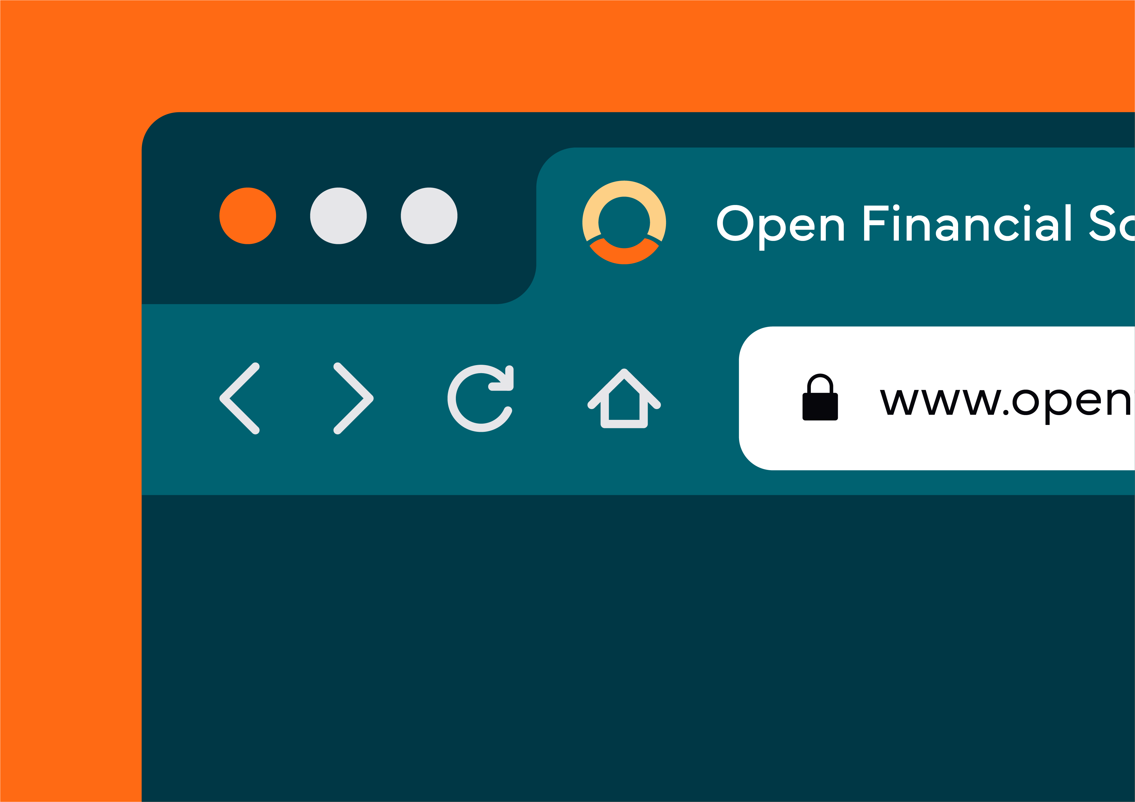
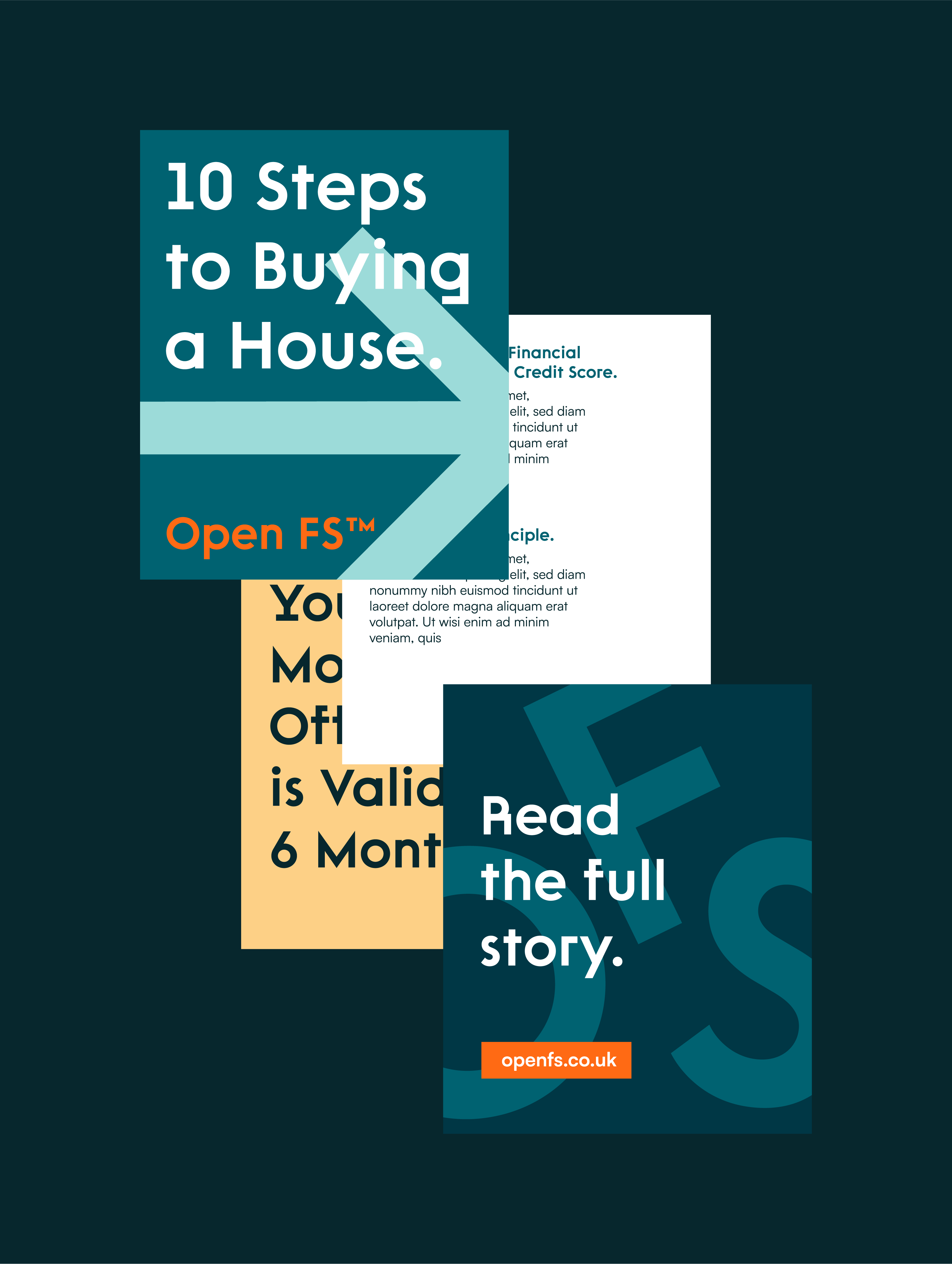
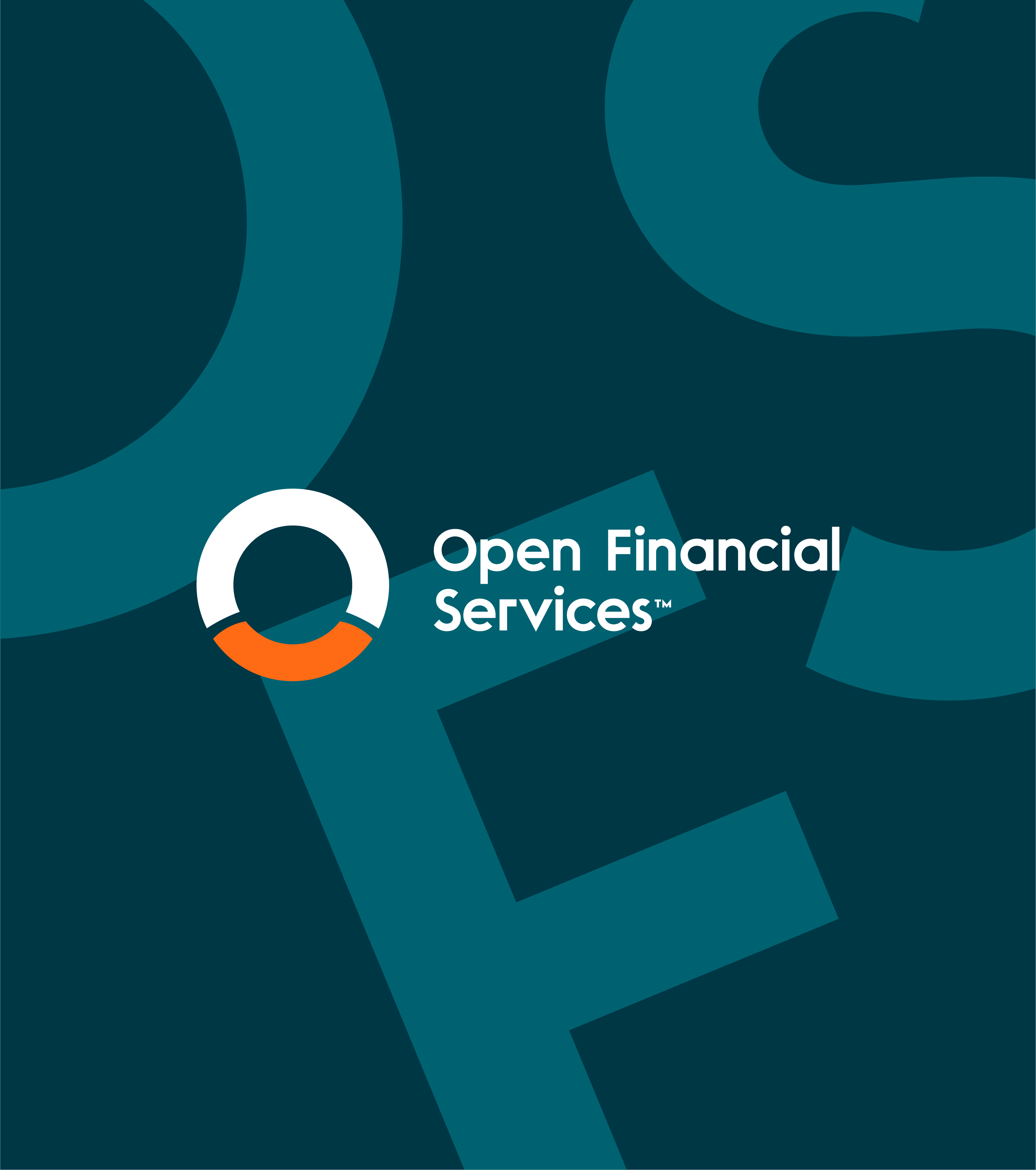
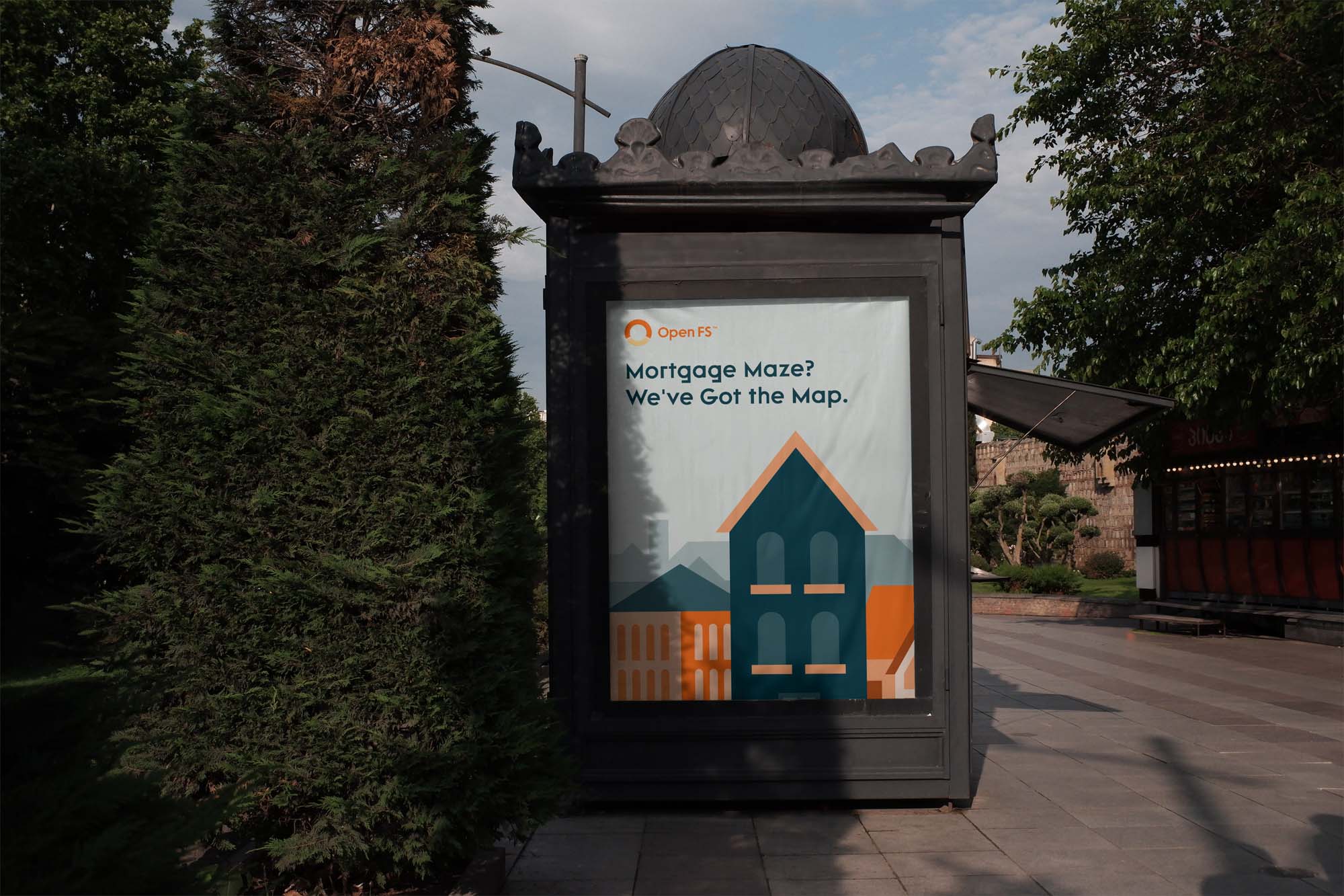
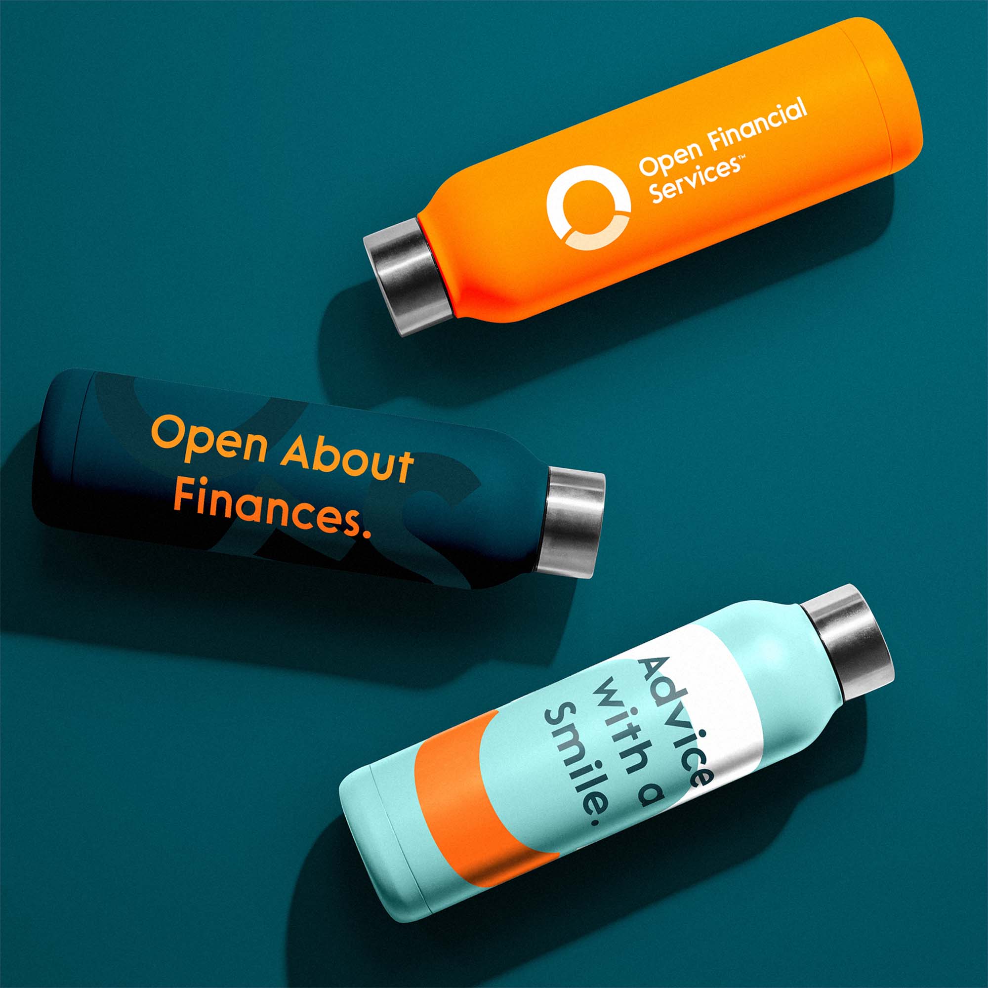
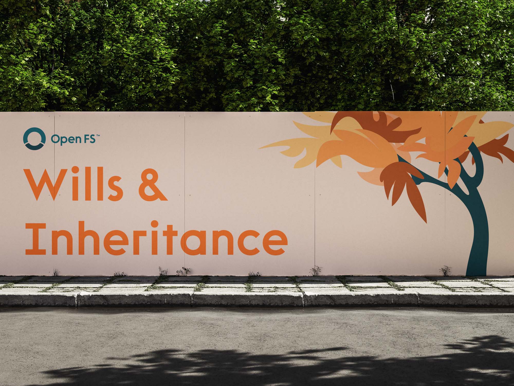
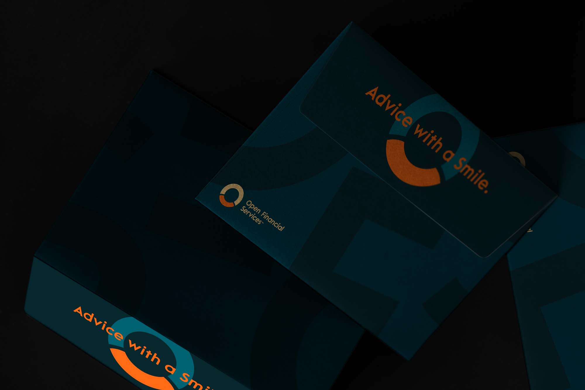
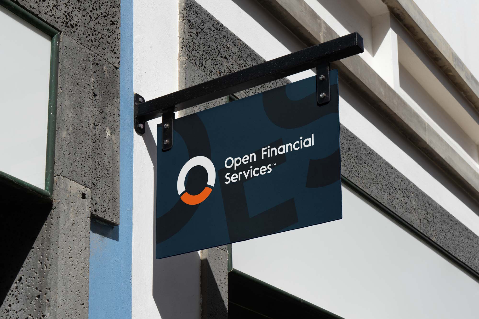
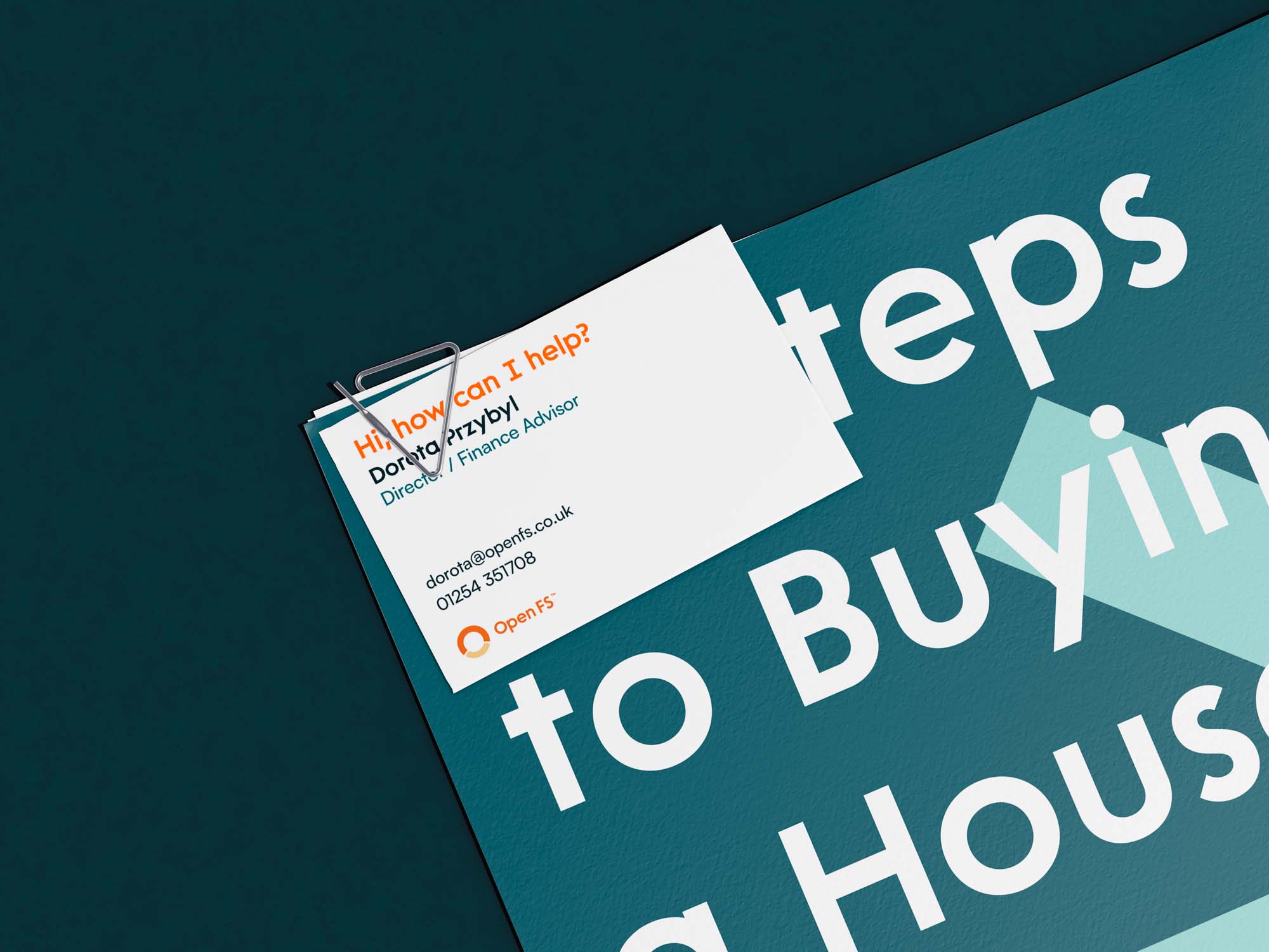
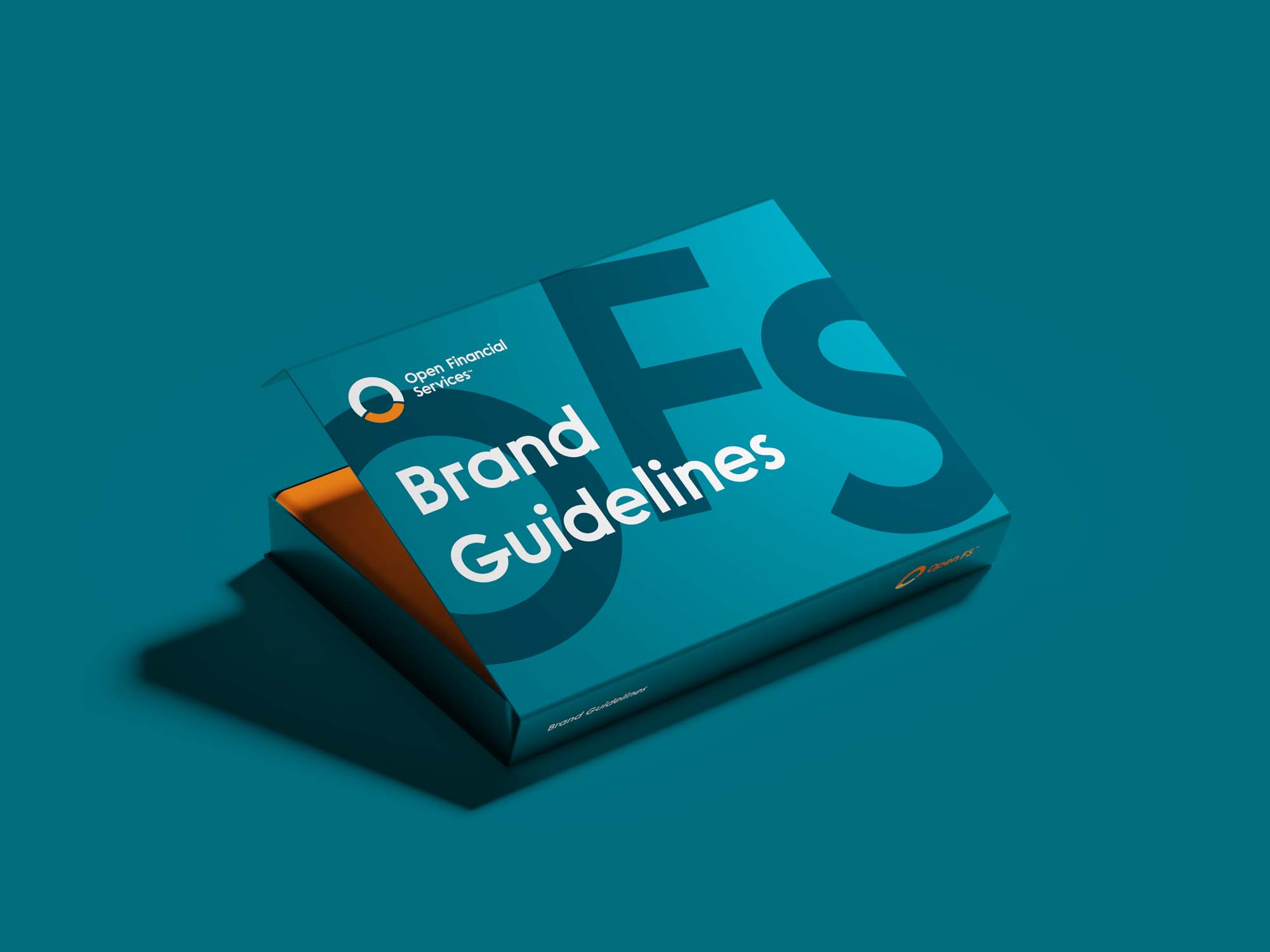
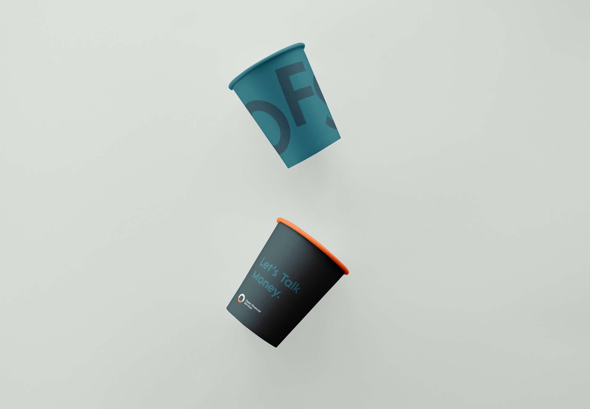
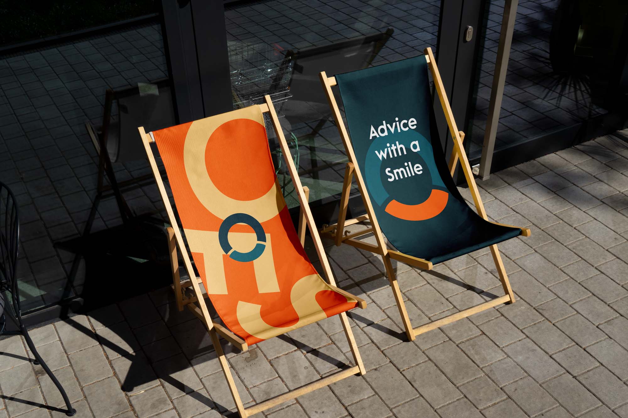
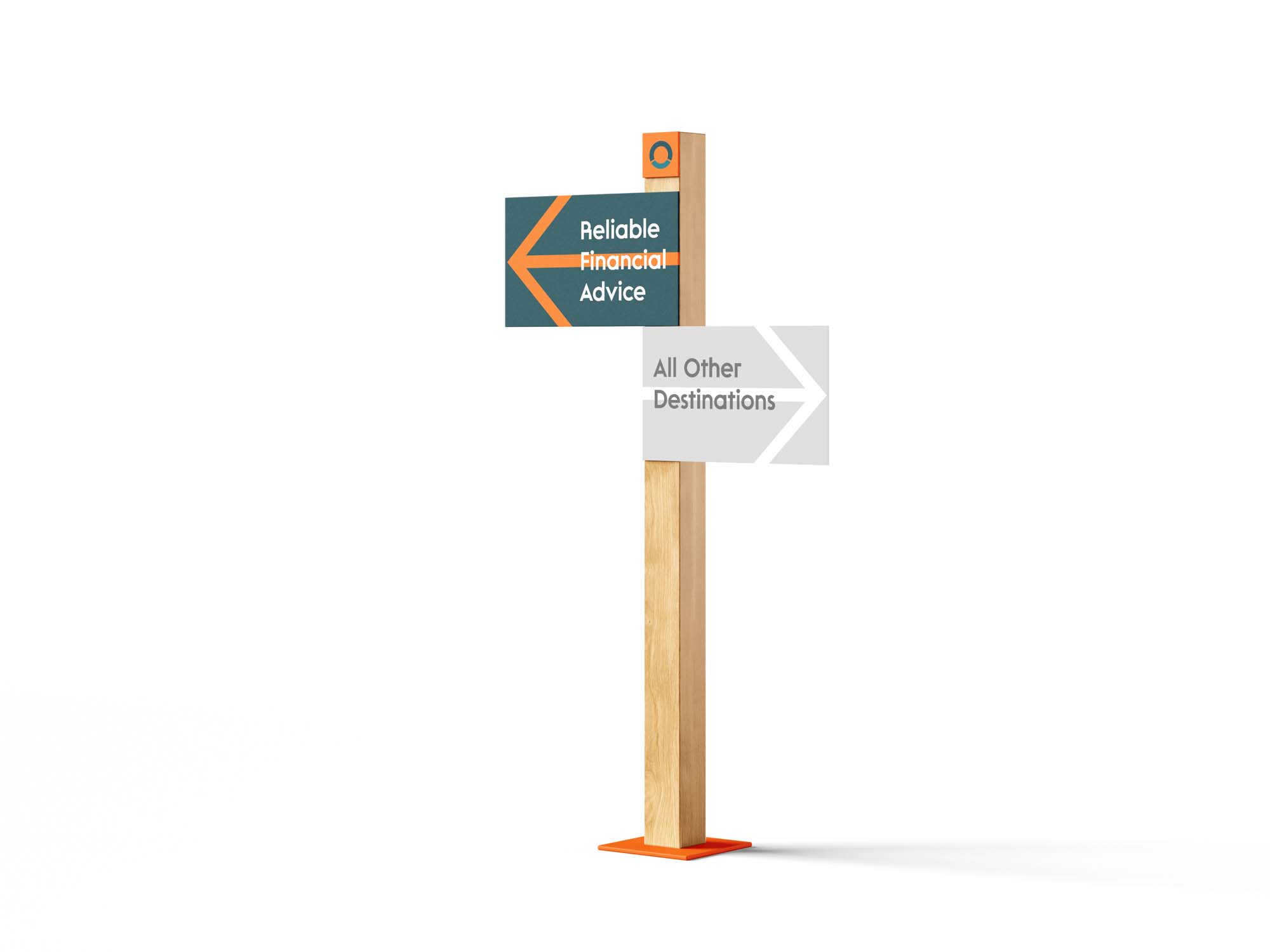
This visual identity exploration for Open Financial Services was all about evolution, not reinvention. As a trusted local financial advisory firm with years of brand equity behind them, the goal was to look confidently toward the future while respecting the foundations already in place. Rather than starting from scratch, we focused on elevating what was already working - introducing a refreshed colour palette built around three blue-tinged shades of green to replace the dated greys, while subtly refining the brand's signature orange for better balance and Pantone alignment. Together, these changes gave the brand a renewed sense of energy, while maintaining familiarity.
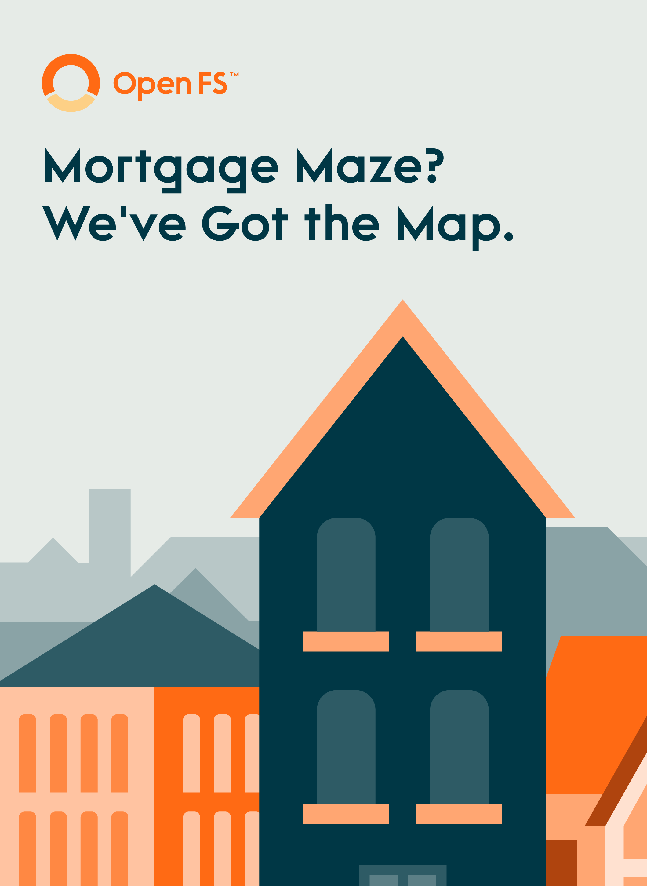
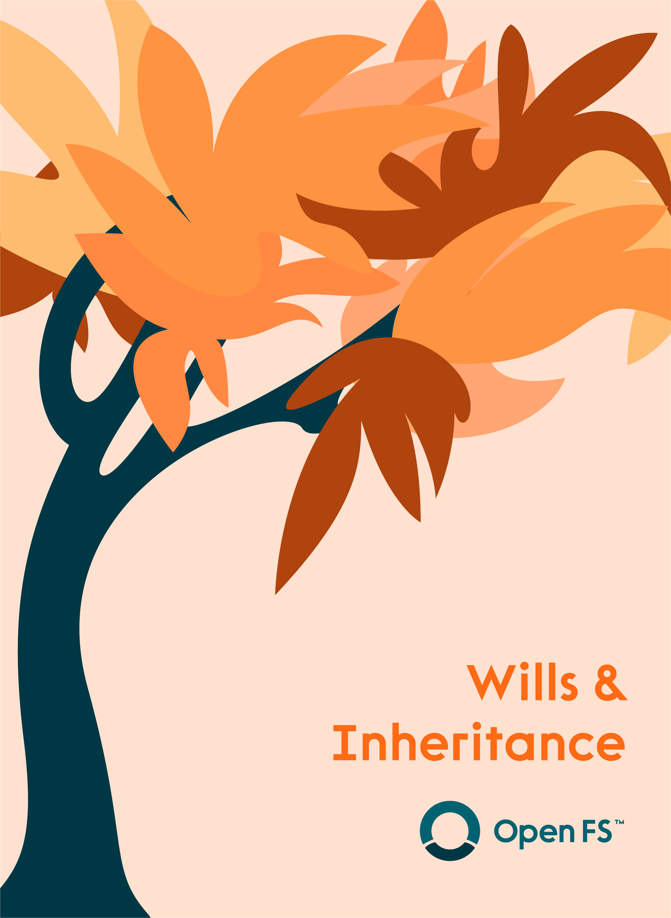
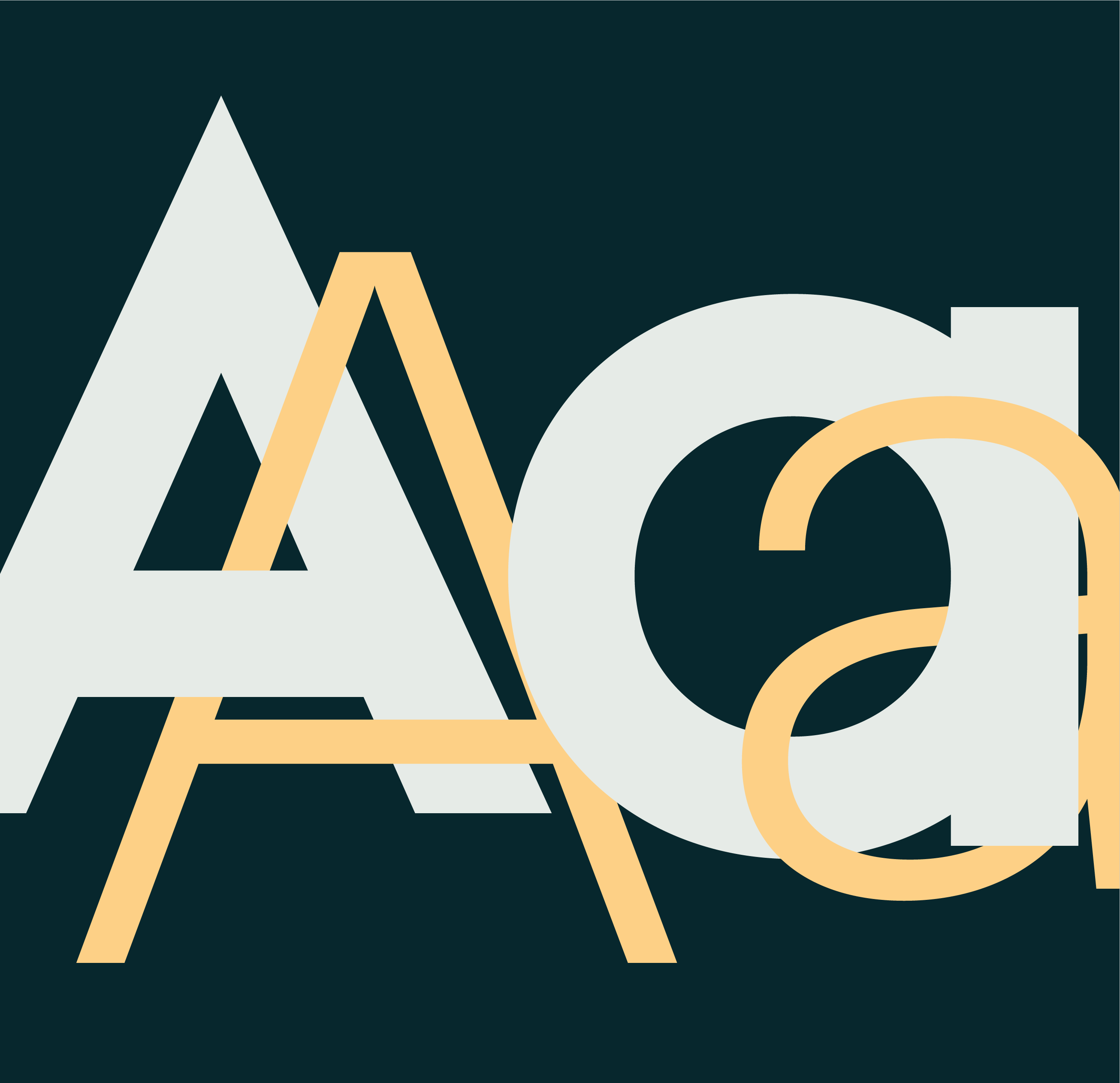
Alongside the refreshed palette, we introduced a new typographic system - pairing Rawest, a geometric grotesque, with the clean and legible Satoshi - to strike the right balance between boldness and accessibility. The new brand direction also features elegant, minimal vector illustrations that help bring warmth and personality to the identity. With a carefully crafted 'O' lettermark - featuring a subtle smile hidden in the curve - we captured the essence of Open FS: a brand that's trustworthy, optimistic, and ready to connect with a younger generation of clients. The result is a forward-facing vision for the business grounded in its roots but designed to grow.